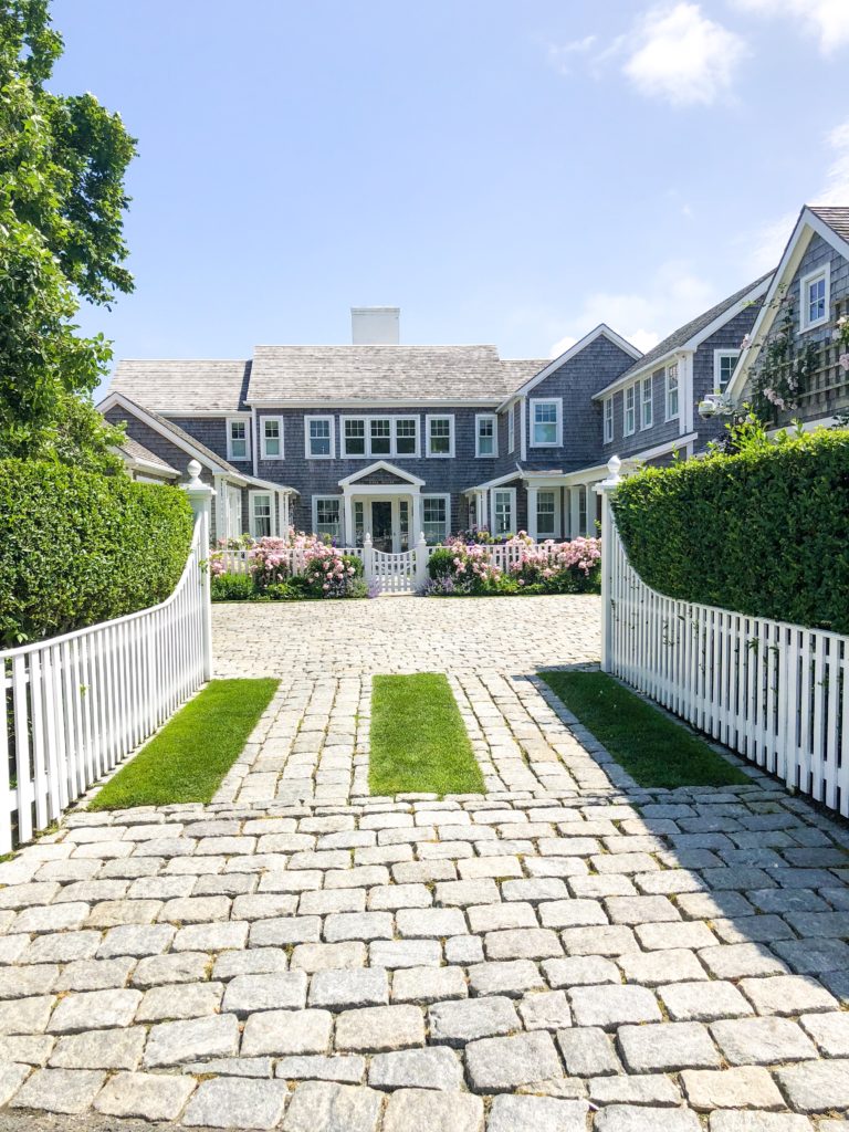
It is pretty amazing how quickly things can be transformed with a vision, constant work, lots of sweat, and a deadline! Luckily, with this guest bathroom remodel, I knew how I wanted it to transform from the start. My husband re-designed the layout of the bathroom in CAD and removed everything that was in the original room. Before we began the remodel of this entire home, we made an agreement with the sellers to keep the outside facade the same structurally. We were also bound by many historical preservation association rules. Inside the home, we were able to put our ideas into play for how to redesign the layout to make it work for our family. It was a challenge, but I feel like we were able to restore and remodel to create a fresh look. The guest bathroom was at the top of the list to re-do as it needed new structural support from the ground up. You can see how this bathroom looked when we first started by going here for Week 1. To follow the progress…you can see Week 2, Week 3, Week 4, and Week 5. And, now, here are the photos of our One Room Challenge “Final Reveal” of our guest bathroom …
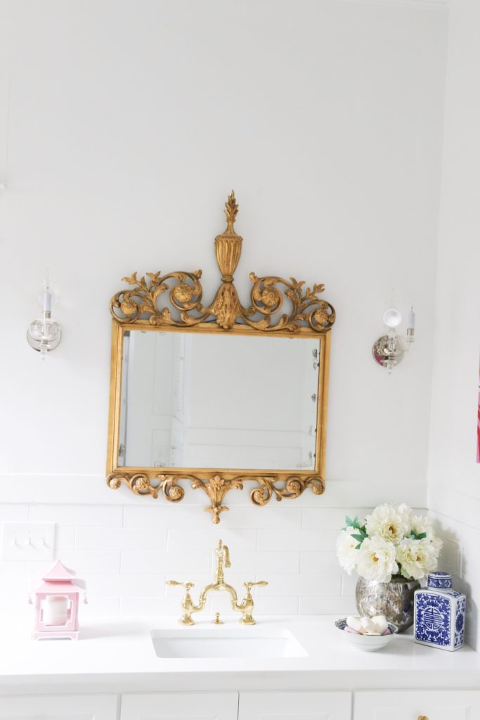
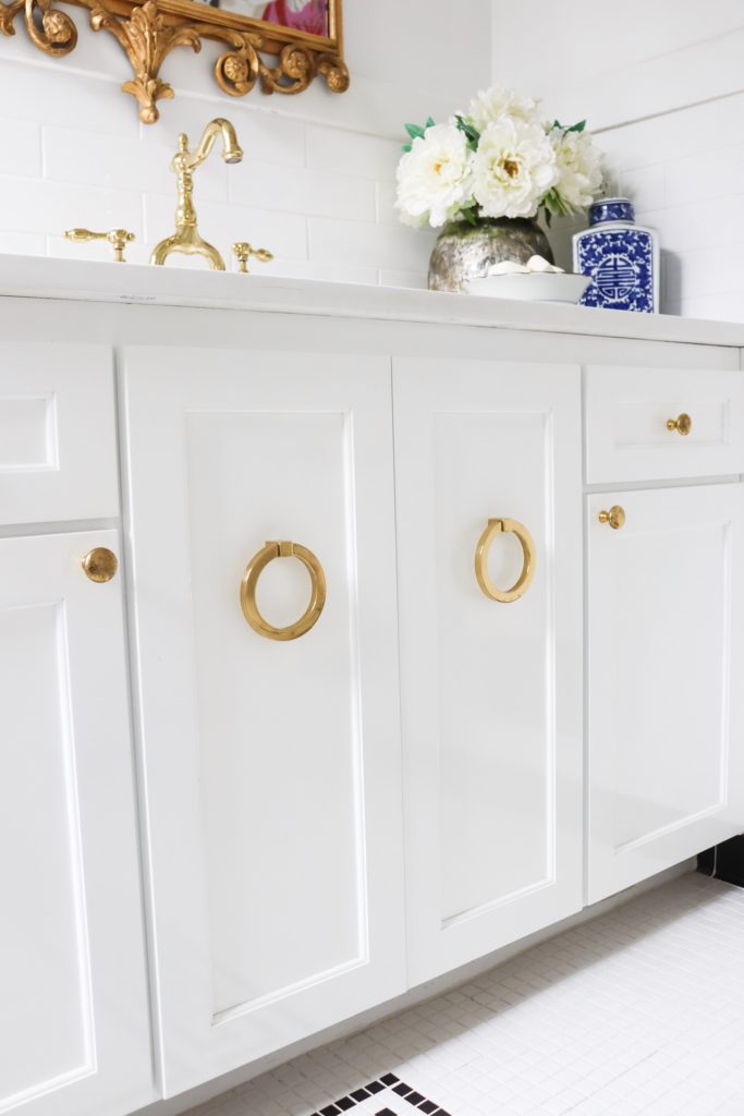
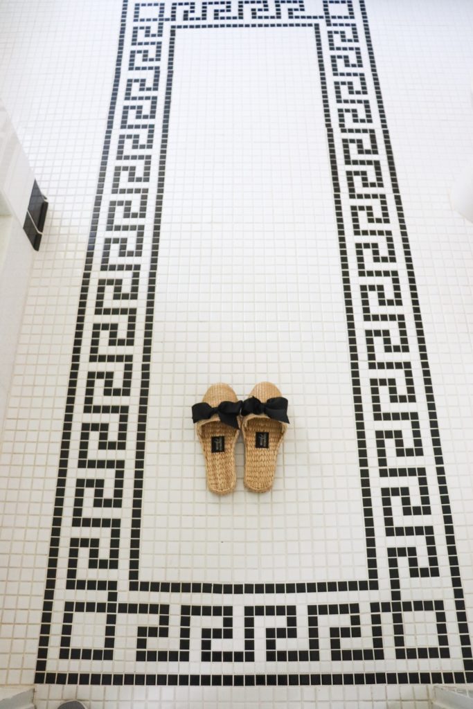
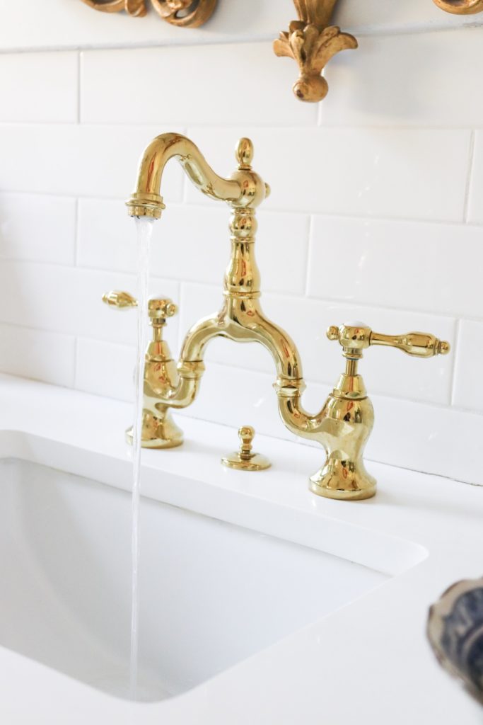
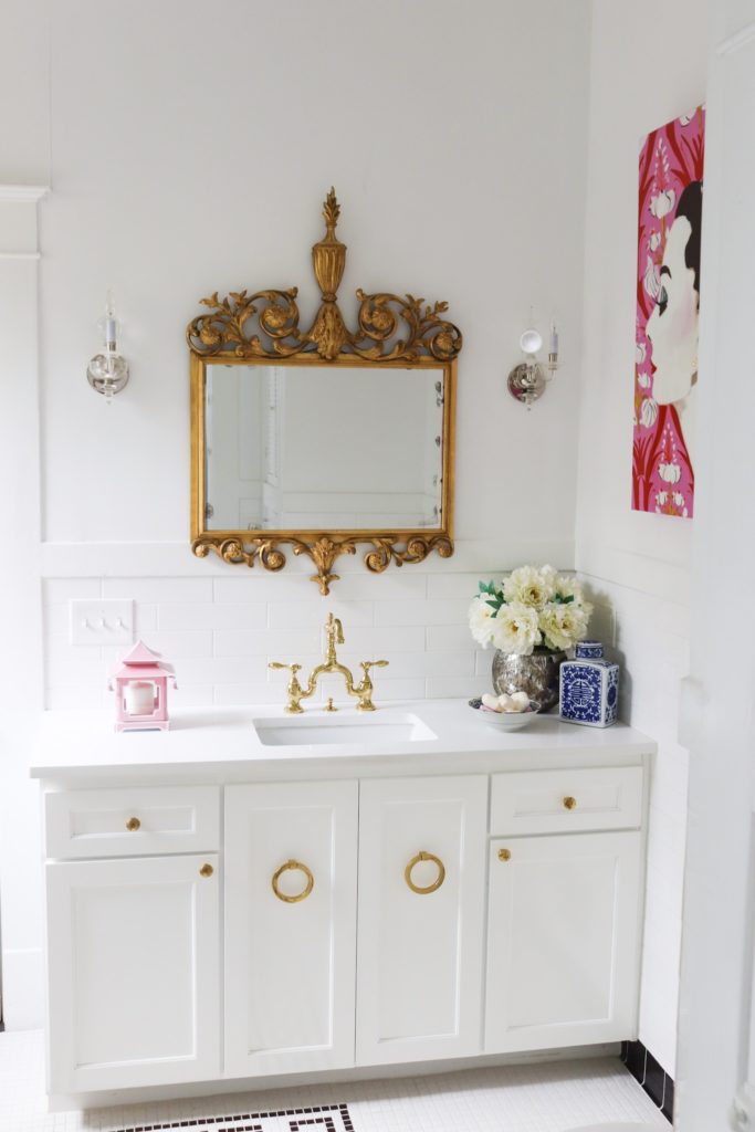
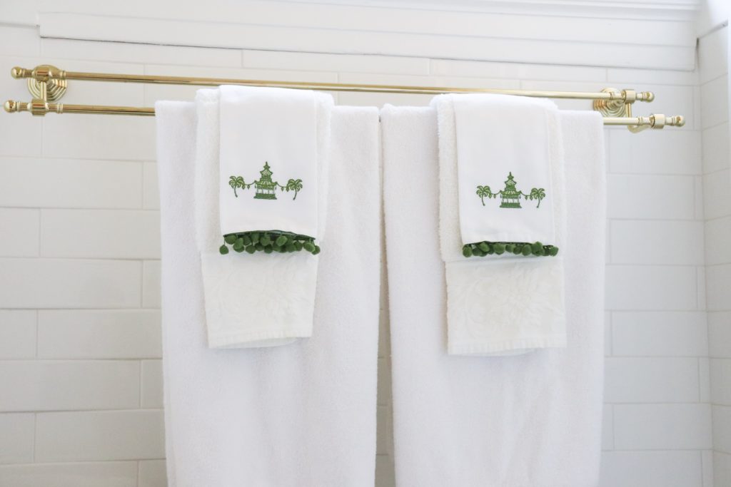
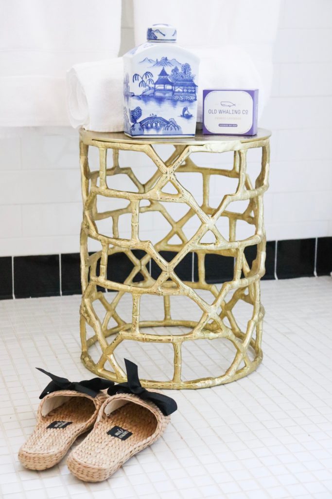
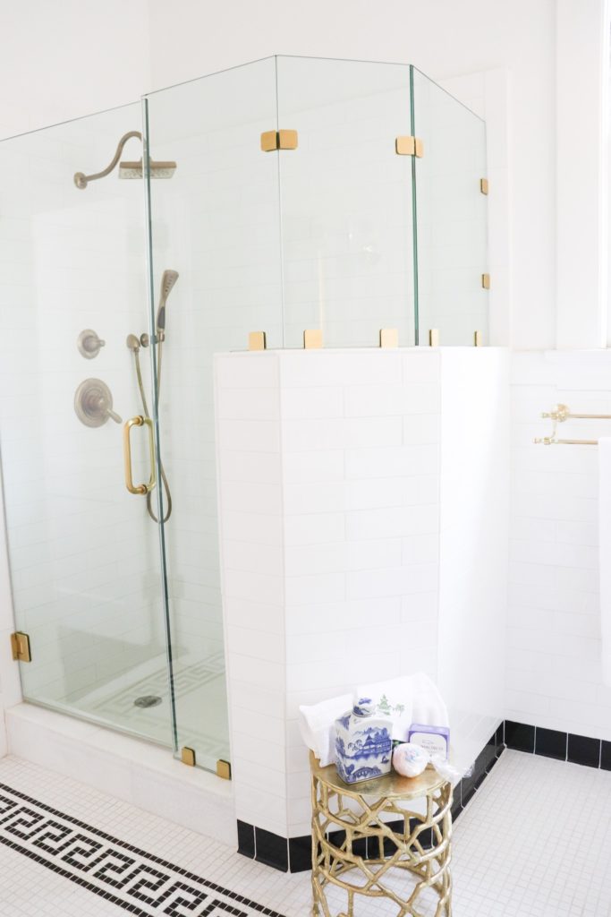
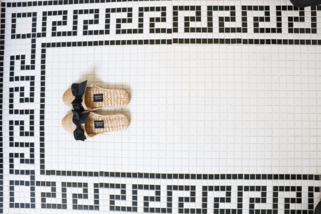
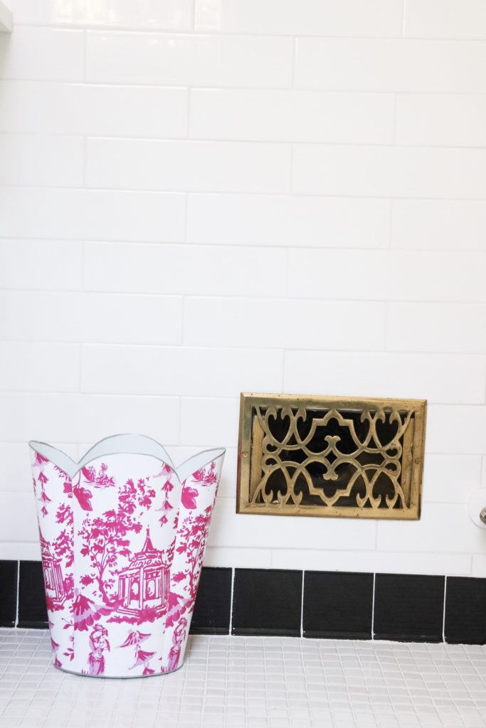
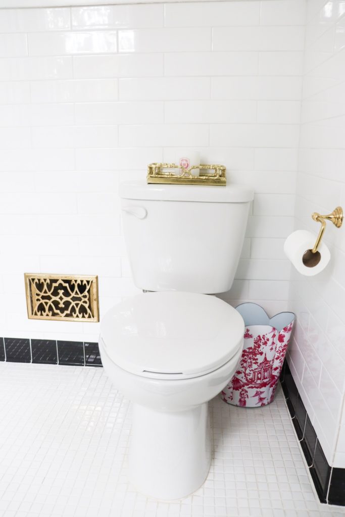
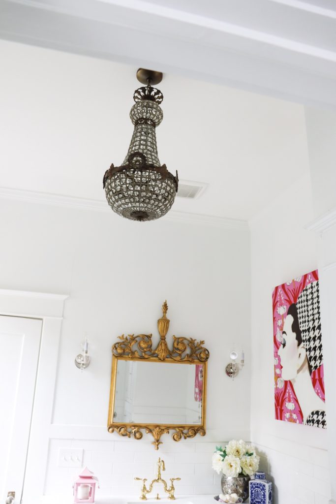
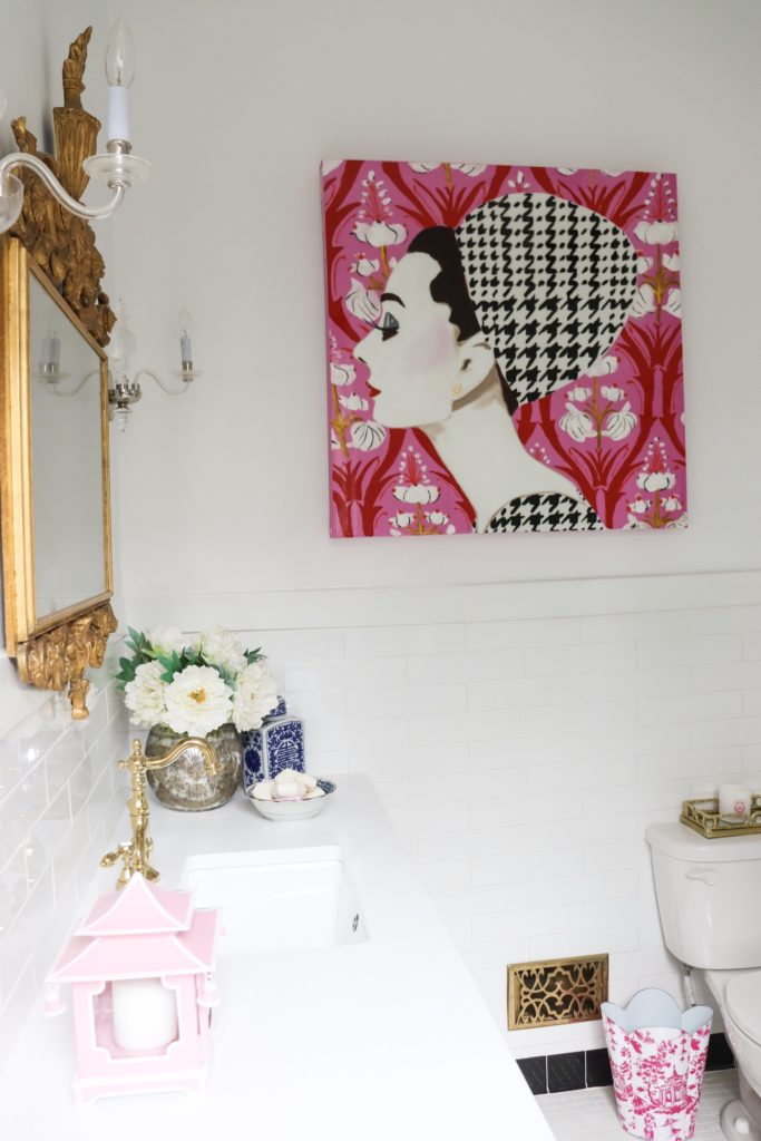
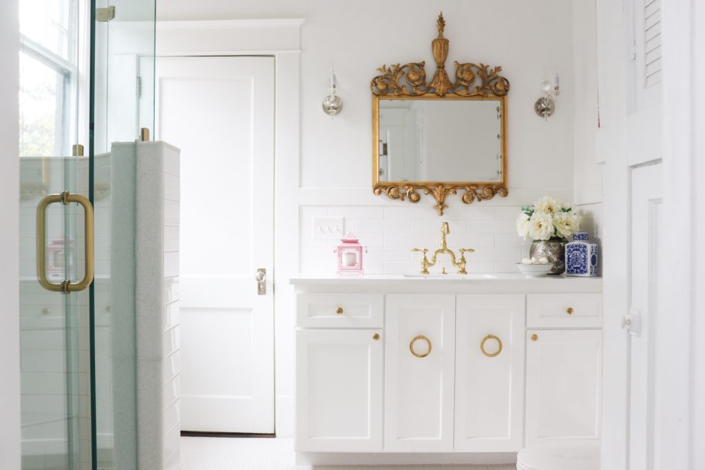
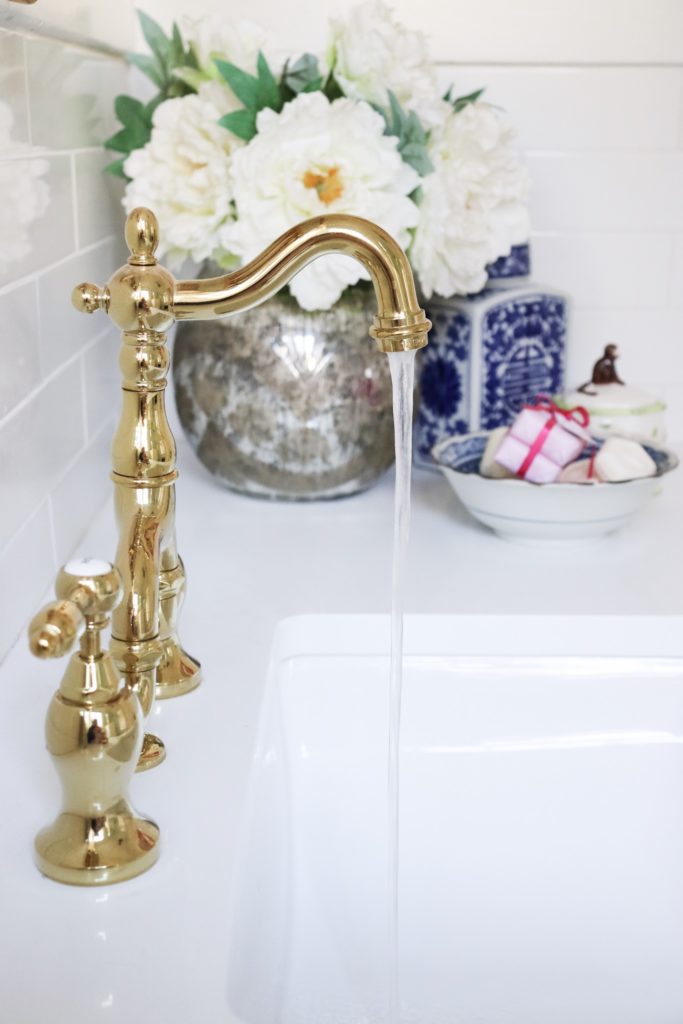
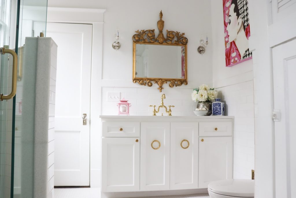
For this bathroom remodel, I wanted to have a crisp, white, clean feel to the room to bring it up to date. Because the house was built in 1918, we had to give up on perfect lines and everything being “plumb”. We put in a new foundation under the house and stabilized everything, but we still have the quirks of a home being 100+ years old. I like the idiosyncrasies of a home that is historical- it adds to the charm and also makes us realize not to sweat the small stuff.
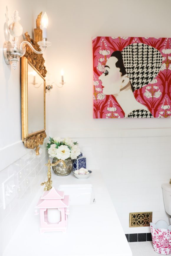
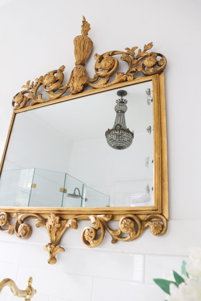
One of my favorite pieces in this make-over is the antique mirror that I bought about 11 years ago. It was originally in my home office at our previous house. I have loved it since I laid eyes on it and wanted it to be used and enjoyed in our new home.
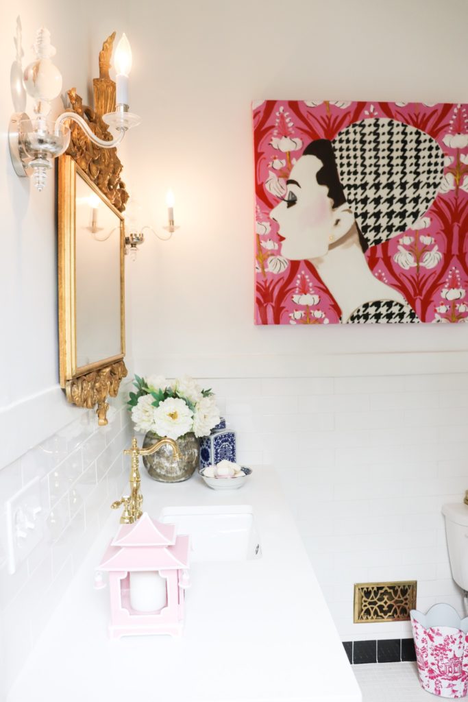
I also love the Ashley Longshore painting that I chose for the room. I bought it and kept it in storage until we were ready to move into our home. The houndstooth pattern is one that I have always been drawn to, and I loved seeing it in this painting. What’s funny to me is that the background in the painting is very similar to the drapery fabric I am planning to use in the guest bedroom that adjoins this bathroom. Those two patterns and the pink won me over!
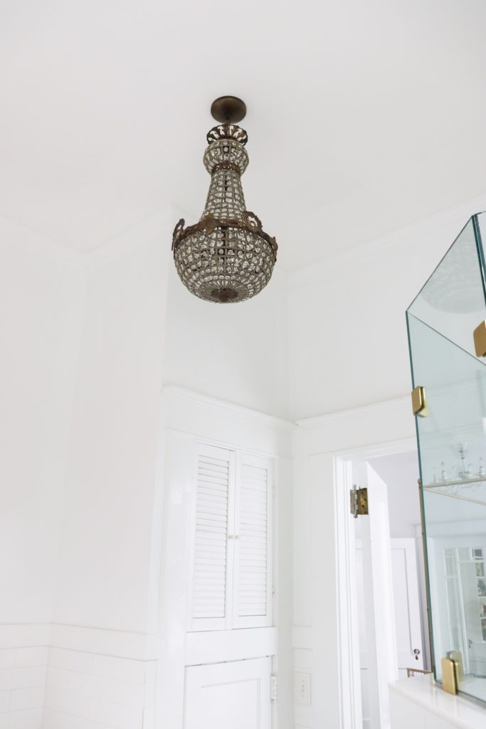
The lighting is also another of my favorites- the sconces and the chandelier complement each other in material and color. As you can see, I like to mix metals, materials, and colors.
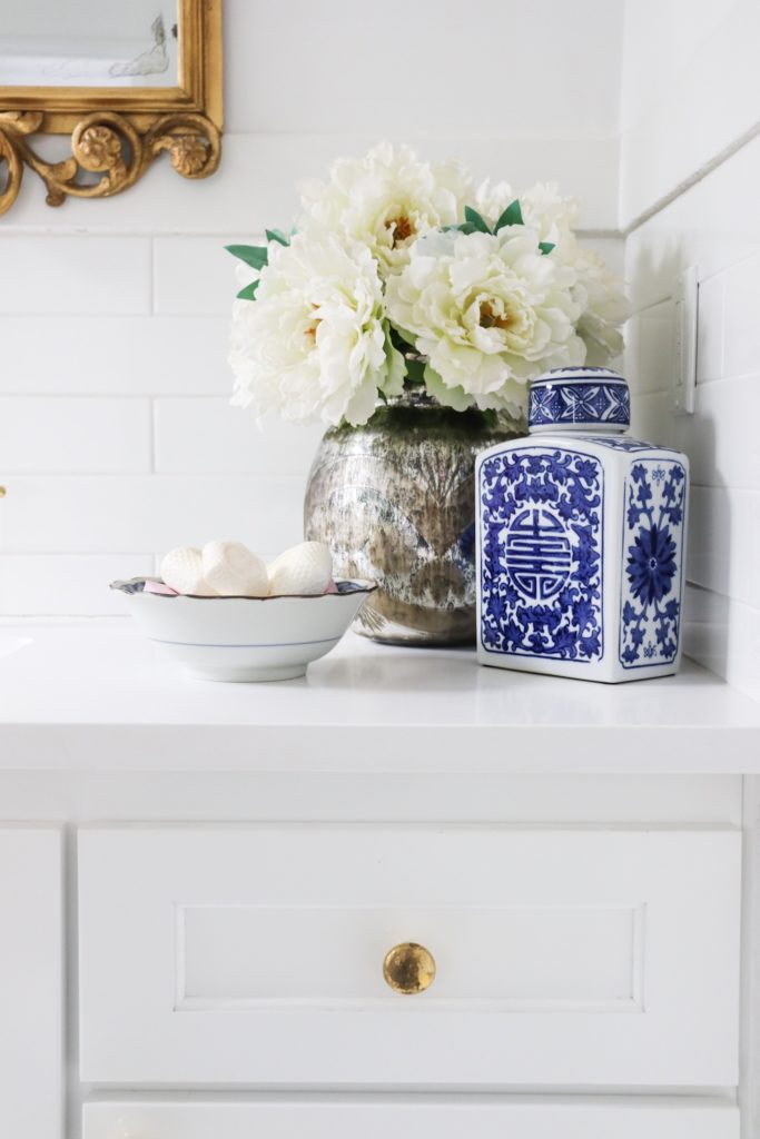
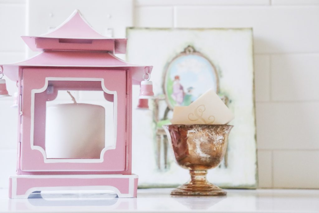
My friends at Parker Kennedy Living always have unique finds and beautiful accessories, and so I made a late night run to pick up items that were from their shop. These helped me put the final touches on the room. I added the new accessories to the guest bath and felt like I needed to scale back on the countertop decor. I snapped a photo and sent it to them, and Lance suggested a few items to edit. It was just what I needed to hear and helped finalize the look I was trying to achieve- clean lines with lots of personality tossed in the mix.
I love how this room has turned out. It is bright and airy and happy. We were able to preserve the feel of an old home while updating everything in it. I love the combination of old and new…from the antique mirror to the pop art on the walls, it was fun to watch the transformation~ and it’s even more fun to live in it completed. There is also something special about doing this project with my husband and knowing we survived it! Lol! My parents always jokingly said not to hang wallpaper with your spouse because it will cause a big argument- and so I am extra proud that we accomplished this home restoration, and I have enjoyed sharing with you the first room that we fully finished!
There are so many really wonderful homes to see at the One Room Challenge- everyone is sharing the finished room that they decorated. I have started looking at each one, and I am loving what I am seeing. I’m excited to see the rest over the weekend when I can take a virtual tour through more of the rooms. I hope you will stop by and see all of the hard work that has paid off in beautiful room after beautiful room! Also, thank you to Linda, creator of ORC, and Better Homes and Gardens, sponsor of the ORC. What a great community!
Wall Paint ~ White Custom Mix ~ I really wanted a glossy, lacquered paint but was convinced to go with less shine- I don’t know exactly what our painter put together to give it a little shine.
White Subway Tile~ Floor & Decor
White Marble- Floor & Decor
White Tile Floor with Greek Key in Black- Floor & Decor
Cabinetry- The Wood Doctor
Sink- Atlanta Marble
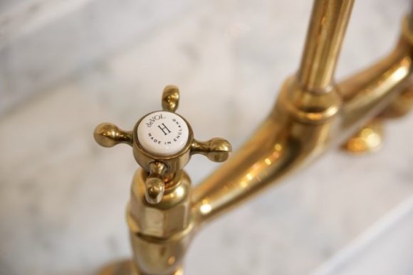
Faucet Hardware- Kingston Brass
Cabinet Hardware- High M Interiors
Antique Mirror- Hawthorne House
Sconces- Hawthorne House
Chandelier- Oyster White Interiors
Artwork- Ashley Longshore
Glass Shower Door and Walls- Quality Glass
Faux Bamboo Side Table- Parker Kennedy Living- The Cellar
Blue and White Porcelain Jars- PKL The Cellar
Pink Pagoda Candle Holder- PKL The Cellar
Tea Towels- PKL- The Cellar
Pink Toile Trash Can- PKL- The Cellar
Mercury Glass Vase- Heery’s Too
Soaps- Appointments at Five
Vent Register- Similar Ones Here
Rattan Slippers- gift from my mom
